
Creating Statistical Organization Charts with Custom Axis Scales
2012-05-31 03:28
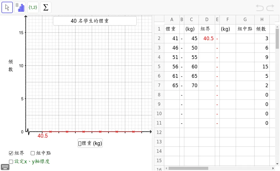
This GeoGebra applet demonstrates how to create statistical organization charts with customizable x-axis and y-axis scales. By utilizing commands like Polygon, PolyLine, and Sequence, it dynamically constructs the chart structure, helping students visually understand the data visualization process and coordinate system scaling in statistics.
In collections
S2,3,5 Statistics
Loading the GeoGebra board and drawing, please wait…
<?xml version="1.0" encoding="utf-8"?>
<geogebra format="4.2" version="4.2.51.0" id="f4139d03-1c12-40d1-b0c3-b46d22ceaf99" xsi:noNamespaceSchemaLocation="http://www.geogebra.org/ggb.xsd" xmlns="" xmlns:xsi="http://www.w3.org/2001/XMLSchema-instance" >
<gui>
<window width="988" height="718" />
<perspectives>
<perspective id="tmp">
<panes>
<pane location="" divider="0.5384615384615384" orientation="1" />
</panes>
<views>
<view id="1" visible="true" inframe="false" stylebar="false" location="3" size="532" window="100,100,600,400" />
<view id="4" toolbar="0 || 2020 , 2021 , 2022 , 66 || 2001 , 2003 , 2002 , 2004 , 2005 || 2040 , 2041 , 2042 , 2044 , 2043" visible="true" inframe="false" stylebar="false" location="1" size="443" window="100,100,600,400" />
<view id="2" visible="false" inframe="false" stylebar="true" location="3" size="221" window="100,100,250,400" />
<view id="8" visible="false" inframe="false" stylebar="false" location="1" size="150" window="50,50,500,500" />
<view id="16" visible="false" inframe="true" stylebar="false" location="1" size="150" window="50,50,500,500" />
<view id="32" visible="false" inframe="true" stylebar="true" location="1" size="150" window="50,50,500,500" />
<view id="64" visible="false" inframe="true" stylebar="false" location="1" size="150" window="50,50,500,500" />
<view id="4097" visible="false" inframe="true" stylebar="true" location="1" size="150" window="50,50,500,500" />
<view id="70" visible="false" inframe="true" stylebar="true" location="1" size="150" window="50,50,500,500" />
</views>
<toolbar show="true" items="0 || 40 | 41 | 42" position="1" help="true" />
<input show="true" cmd="true" top="false" />
<dockBar show="false" east="false" />
</perspective>
</perspectives>
<labelingStyle val="3"/>
<font size="18"/>
<graphicsSettings javaLatexFonts="false"/>
</gui>
<euclidianView>
<size width="532" height="532"/>
<coordSystem xZero="89.60165907203714" yZero="409.28947173338094" scale="11.606708534686954" yscale="23.21341706937391"/>
<evSettings axes="true" grid="false" gridIsBold="false" pointCapturing="2" rightAngleStyle="1" checkboxSize="13" gridType="0"/>
<bgColor r="255" g="255" b="255"/>
<axesColor r="0" g="0" b="0"/>
<gridColor r="192" g="192" b="192"/>
<lineStyle axes="3" grid="10"/>
<axis id="0" show="true" label="" unitLabel="" tickStyle="2" showNumbers="false" tickDistance="1.0" positiveAxis="true"/>
<axis id="1" show="true" label="" unitLabel="" tickStyle="1" showNumbers="true" tickDistance="5.0" positiveAxis="true"/>
<grid distX="1.0" distY="1.0" distTheta="0.5235987755982988"/>
</euclidianView>
<spreadsheetView>
<size width="443" height="532"/>
<prefCellSize width="70" height="33"/>
<spreadsheetColumn id="0" width="54"/>
<spreadsheetColumn id="1" width="16"/>
<spreadsheetColumn id="2" width="51"/>
<spreadsheetColumn id="3" width="57"/>
<spreadsheetColumn id="4" width="16"/>
<spreadsheetColumn id="5" width="57"/>
<spreadsheetColumn id="6" width="65"/>
<spreadsheetColumn id="7" width="53"/>
<selection hScroll="0" vScroll="0" column="-1" row="-1"/>
<layout showFormulaBar="false" showGrid="true" showHScrollBar="true" showVScrollBar="true" showBrowserPanel="false" showColumnHeader="true" showRowHeader ="true" allowSpecialEditor="false" allowToolTips="true" equalsRequired="false" autoComplete="false"/>
</spreadsheetView>
<kernel>
<continuous val="false"/>
<usePathAndRegionParameters val="true"/>
<decimals val="2"/>
<angleUnit val="degree"/>
<algebraStyle val="0"/>
<coordStyle val="0"/>
<angleFromInvTrig val="false"/>
</kernel>
<scripting blocked="false" disabled="false"/>
<construction title="" author="" date="">
<element type="numeric" label="yint1'">
<value val="2.5"/>
<show object="false" label="false"/>
<objColor r="0" g="0" b="0" alpha="0.1"/>
<layer val="1"/>
<labelMode val="1"/>
<animation step="1" speed="1" type="0" playing="false"/>
</element>
<element type="numeric" label="xint1'">
<value val="5.0"/>
<show object="false" label="false"/>
<objColor r="0" g="0" b="0" alpha="0.1"/>
<layer val="1"/>
<labelMode val="1"/>
<animation step="1" speed="1" type="0" playing="false"/>
</element>
<element type="numeric" label="A3">
<value val="46.0"/>
<show object="false" label="false"/>
<objColor r="0" g="0" b="0" alpha="0.1"/>
<layer val="0"/>
<labelMode val="1"/>
<animation step="1" speed="1" type="0" playing="false"/>
<auxiliary val="true"/>
</element>
<element type="numeric" label="C2">
<value val="45.0"/>
<show object="false" label="false"/>
<objColor r="0" g="0" b="0" alpha="0.1"/>
<layer val="0"/>
<labelMode val="1"/>
<animation step="1" speed="1" type="0" playing="false"/>
<auxiliary val="true"/>
</element>
<element type="numeric" label="A2">
<value val="41.0"/>
<show object="false" label="false"/>
<objColor r="0" g="0" b="0" alpha="0.1"/>
<layer val="0"/>
<labelMode val="1"/>
<animation step="1" speed="1" type="0" playing="false"/>
<auxiliary val="true"/>
</element>
<command name="If">
<input a0="C2 - A2 > 0" a1="C2 - A2 + A3 - C2" a2="5"/>
<output a0="k"/>
</command>
<element type="numeric" label="k">
<value val="5.0"/>
<objColor r="0" g="0" b="0" alpha="0.1"/>
</element>
<expression label="unitx" exp="(x(Corner[3]) - x(Corner[1])) / 100" />
<element type="numeric" label="unitx">
<value val="0.4600787539414184"/>
<objColor r="0" g="0" b="0" alpha="0.1"/>
</element>
<expression label="A1" exp=""體重""/>
<element type="text" label="A1">
<show object="false" label="false"/>
<objColor r="0" g="0" b="0" alpha="0.0"/>
<layer val="0"/>
<labelMode val="0"/>
</element>
<expression label="B2" exp=""-""/>
<element type="text" label="B2">
<show object="false" label="false"/>
<objColor r="0" g="0" b="0" alpha="0.0"/>
<layer val="0"/>
<labelMode val="0"/>
</element>
<expression label="D1" exp=""組界""/>
<element type="text" label="D1">
<show object="false" label="false"/>
<objColor r="0" g="0" b="0" alpha="0.0"/>
<layer val="0"/>
<labelMode val="0"/>
</element>
<expression label="E2" exp=""-""/>
<element type="text" label="E2">
<show object="false" label="false"/>
<objColor r="255" g="0" b="0" alpha="0.0"/>
<layer val="0"/>
<labelMode val="0"/>
</element>
<element type="numeric" label="D2">
<value val="40.5"/>
<show object="false" label="false"/>
<objColor r="255" g="0" b="0" alpha="0.1"/>
<layer val="0"/>
<labelMode val="1"/>
<animation step="1" speed="1" type="0" playing="false"/>
<auxiliary val="true"/>
</element>
<expression label="H1" exp=""頻數""/>
<element type="text" label="H1">
<show object="false" label="false"/>
<objColor r="0" g="0" b="0" alpha="0.0"/>
<layer val="0"/>
<labelMode val="0"/>
</element>
<element type="numeric" label="H2">
<value val="3.0"/>
<show object="false" label="false"/>
<objColor r="0" g="0" b="0" alpha="0.1"/>
<layer val="0"/>
<labelMode val="1"/>
<animation step="1" speed="1" type="0" playing="false"/>
<auxiliary val="true"/>
</element>
<element type="numeric" label="H3">
<value val="6.0"/>
<show object="false" label="false"/>
<objColor r="0" g="0" b="0" alpha="0.1"/>
<layer val="0"/>
<labelMode val="1"/>
<animation step="1" speed="1" type="0" playing="false"/>
<auxiliary val="true"/>
</element>
<element type="numeric" label="H4">
<value val="9.0"/>
<show object="false" label="false"/>
<objColor r="0" g="0" b="0" alpha="0.1"/>
<layer val="0"/>
<labelMode val="1"/>
<animation step="1" speed="1" type="0" playing="false"/>
<auxiliary val="true"/>
</element>
<element type="numeric" label="H5">
<value val="15.0"/>
<show object="false" label="false"/>
<objColor r="0" g="0" b="0" alpha="0.1"/>
<layer val="0"/>
<labelMode val="1"/>
<animation step="1" speed="1" type="0" playing="false"/>
<auxiliary val="true"/>
</element>
<element type="numeric" label="H6">
<value val="5.0"/>
<show object="false" label="false"/>
<objColor r="0" g="0" b="0" alpha="0.1"/>
<layer val="0"/>
<labelMode val="1"/>
<animation step="1" speed="1" type="0" playing="false"/>
<auxiliary val="true"/>
</element>
<expression label="B3" exp=""-""/>
<element type="text" label="B3">
<show object="false" label="false"/>
<objColor r="0" g="0" b="0" alpha="0.0"/>
<layer val="0"/>
<labelMode val="0"/>
</element>
<element type="numeric" label="H7">
<value val="2.0"/>
<show object="false" label="false"/>
<objColor r="0" g="0" b="0" alpha="0.1"/>
<layer val="0"/>
<labelMode val="1"/>
<animation step="1" speed="1" type="0" playing="false"/>
<auxiliary val="true"/>
</element>
<element type="numeric" label="H8">
<value val="0.0"/>
<show object="false" label="false"/>
<objColor r="0" g="0" b="0" alpha="0.1"/>
<layer val="0"/>
<labelMode val="1"/>
<animation step="1" speed="1" type="0" playing="false"/>
<auxiliary val="true"/>
</element>
<element type="numeric" label="H9">
<value val="0.0"/>
<show object="false" label="false"/>
<objColor r="0" g="0" b="0" alpha="0.1"/>
<layer val="0"/>
<labelMode val="1"/>
<animation step="1" speed="1" type="0" playing="false"/>
<auxiliary val="true"/>
</element>
<element type="numeric" label="H10">
<value val="0.0"/>
<show object="false" label="false"/>
<objColor r="0" g="0" b="0" alpha="0.1"/>
<layer val="0"/>
<labelMode val="1"/>
<animation step="1" speed="1" type="0" playing="false"/>
<auxiliary val="true"/>
</element>
<element type="numeric" label="H11">
<value val="0.0"/>
<show object="false" label="false"/>
<objColor r="0" g="0" b="0" alpha="0.1"/>
<layer val="0"/>
<labelMode val="1"/>
<animation step="1" speed="1" type="0" playing="false"/>
<auxiliary val="true"/>
</element>
<expression label="E7" exp=""-""/>
<element type="text" label="E7">
<show object="false" label="false"/>
<objColor r="255" g="0" b="0" alpha="0.0"/>
<layer val="0"/>
<labelMode val="0"/>
</element>
<expression label="E8" exp=""-""/>
<element type="text" label="E8">
<show object="false" label="false"/>
<objColor r="255" g="0" b="0" alpha="0.0"/>
<layer val="0"/>
<labelMode val="0"/>
</element>
<expression label="E9" exp=""-""/>
<element type="text" label="E9">
<show object="false" label="false"/>
<objColor r="255" g="0" b="0" alpha="0.0"/>
<layer val="0"/>
<labelMode val="0"/>
</element>
<expression label="E10" exp=""-""/>
<element type="text" label="E10">
<show object="false" label="false"/>
<objColor r="255" g="0" b="0" alpha="0.0"/>
<layer val="0"/>
<labelMode val="0"/>
</element>
<expression label="E11" exp=""-""/>
<element type="text" label="E11">
<show object="false" label="false"/>
<objColor r="255" g="0" b="0" alpha="0.0"/>
<layer val="0"/>
<labelMode val="0"/>
</element>
<expression label="E3" exp=""-""/>
<element type="text" label="E3">
<show object="false" label="false"/>
<objColor r="255" g="0" b="0" alpha="0.0"/>
<layer val="0"/>
<labelMode val="0"/>
</element>
<expression label="E4" exp=""-""/>
<element type="text" label="E4">
<show object="false" label="false"/>
<objColor r="255" g="0" b="0" alpha="0.0"/>
<layer val="0"/>
<labelMode val="0"/>
</element>
<expression label="E5" exp=""-""/>
<element type="text" label="E5">
<show object="false" label="false"/>
<objColor r="255" g="0" b="0" alpha="0.0"/>
<layer val="0"/>
<labelMode val="0"/>
</element>
<expression label="E6" exp=""-""/>
<element type="text" label="E6">
<show object="false" label="false"/>
<objColor r="255" g="0" b="0" alpha="0.0"/>
<layer val="0"/>
<labelMode val="0"/>
</element>
<expression label="B4" exp=""-""/>
<element type="text" label="B4">
<show object="false" label="false"/>
<objColor r="0" g="0" b="0" alpha="0.0"/>
<layer val="0"/>
<labelMode val="0"/>
</element>
<expression label="B5" exp=""-""/>
<element type="text" label="B5">
<show object="false" label="false"/>
<objColor r="0" g="0" b="0" alpha="0.0"/>
<layer val="0"/>
<labelMode val="0"/>
</element>
<expression label="B6" exp=""-""/>
<element type="text" label="B6">
<show object="false" label="false"/>
<objColor r="0" g="0" b="0" alpha="0.0"/>
<layer val="0"/>
<labelMode val="0"/>
</element>
<expression label="B7" exp=""-""/>
<element type="text" label="B7">
<show object="false" label="false"/>
<objColor r="0" g="0" b="0" alpha="0.0"/>
<layer val="0"/>
<labelMode val="0"/>
</element>
<expression label="B8" exp=""-""/>
<element type="text" label="B8">
<show object="false" label="false"/>
<objColor r="0" g="0" b="0" alpha="0.0"/>
<layer val="0"/>
<labelMode val="0"/>
</element>
<expression label="B9" exp=""-""/>
<element type="text" label="B9">
<show object="false" label="false"/>
<objColor r="0" g="0" b="0" alpha="0.0"/>
<layer val="0"/>
<labelMode val="0"/>
</element>
<expression label="B10" exp=""-""/>
<element type="text" label="B10">
<show object="false" label="false"/>
<objColor r="0" g="0" b="0" alpha="0.0"/>
<layer val="0"/>
<labelMode val="0"/>
</element>
<expression label="B11" exp=""-""/>
<element type="text" label="B11">
<show object="false" label="false"/>
<objColor r="0" g="0" b="0" alpha="0.0"/>
<layer val="0"/>
<labelMode val="0"/>
</element>
<element type="numeric" label="C3">
<value val="50.0"/>
<show object="false" label="false"/>
<objColor r="0" g="0" b="0" alpha="0.1"/>
<layer val="0"/>
<labelMode val="1"/>
<animation step="1" speed="1" type="0" playing="false"/>
<auxiliary val="true"/>
</element>
<element type="numeric" label="A4">
<value val="51.0"/>
<show object="false" label="false"/>
<objColor r="0" g="0" b="0" alpha="0.1"/>
<layer val="0"/>
<labelMode val="1"/>
<animation step="1" speed="1" type="0" playing="false"/>
<auxiliary val="true"/>
</element>
<element type="numeric" label="C4">
<value val="55.0"/>
<show object="false" label="false"/>
<objColor r="0" g="0" b="0" alpha="0.1"/>
<layer val="0"/>
<labelMode val="1"/>
<animation step="1" speed="1" type="0" playing="false"/>
<auxiliary val="true"/>
</element>
<element type="numeric" label="A5">
<value val="56.0"/>
<show object="false" label="false"/>
<objColor r="0" g="0" b="0" alpha="0.1"/>
<layer val="0"/>
<labelMode val="1"/>
<animation step="1" speed="1" type="0" playing="false"/>
<auxiliary val="true"/>
</element>
<element type="numeric" label="C5">
<value val="60.0"/>
<show object="false" label="false"/>
<objColor r="0" g="0" b="0" alpha="0.1"/>
<layer val="0"/>
<labelMode val="1"/>
<animation step="1" speed="1" type="0" playing="false"/>
<auxiliary val="true"/>
</element>
<element type="numeric" label="A6">
<value val="61.0"/>
<show object="false" label="false"/>
<objColor r="0" g="0" b="0" alpha="0.1"/>
<layer val="0"/>
<labelMode val="1"/>
<animation step="1" speed="1" type="0" playing="false"/>
<auxiliary val="true"/>
</element>
<element type="numeric" label="C6">
<value val="65.0"/>
<show object="false" label="false"/>
<objColor r="0" g="0" b="0" alpha="0.1"/>
<layer val="0"/>
<labelMode val="1"/>
<animation step="1" speed="1" type="0" playing="false"/>
<auxiliary val="true"/>
</element>
<expression label="A8" exp="" ""/>
<element type="text" label="A8">
<show object="false" label="false"/>
<objColor r="0" g="0" b="0" alpha="0.0"/>
<layer val="0"/>
<labelMode val="0"/>
</element>
<expression label="A9" exp="" ""/>
<element type="text" label="A9">
<show object="false" label="false"/>
<objColor r="0" g="0" b="0" alpha="0.0"/>
<layer val="0"/>
<labelMode val="0"/>
</element>
<expression label="A10" exp="" ""/>
<element type="text" label="A10">
<show object="false" label="false"/>
<objColor r="0" g="0" b="0" alpha="0.0"/>
<layer val="0"/>
<labelMode val="0"/>
</element>
<expression label="A11" exp="" ""/>
<element type="text" label="A11">
<show object="false" label="false"/>
<objColor r="0" g="0" b="0" alpha="0.0"/>
<layer val="0"/>
<labelMode val="0"/>
</element>
<expression label="C8" exp="" ""/>
<element type="text" label="C8">
<show object="false" label="false"/>
<objColor r="0" g="0" b="0" alpha="0.0"/>
<layer val="0"/>
<labelMode val="0"/>
</element>
<expression label="C9" exp="" ""/>
<element type="text" label="C9">
<show object="false" label="false"/>
<objColor r="0" g="0" b="0" alpha="0.0"/>
<layer val="0"/>
<labelMode val="0"/>
</element>
<expression label="C10" exp="" ""/>
<element type="text" label="C10">
<show object="false" label="false"/>
<objColor r="0" g="0" b="0" alpha="0.0"/>
<layer val="0"/>
<labelMode val="0"/>
</element>
<expression label="C11" exp="" ""/>
<element type="text" label="C11">
<show object="false" label="false"/>
<objColor r="0" g="0" b="0" alpha="0.0"/>
<layer val="0"/>
<labelMode val="0"/>
</element>
<expression label="D6" exp="" ""/>
<element type="text" label="D6">
<show object="false" label="false"/>
<objColor r="255" g="0" b="0" alpha="0.0"/>
<layer val="0"/>
<labelMode val="0"/>
</element>
<expression label="D7" exp="" ""/>
<element type="text" label="D7">
<show object="false" label="false"/>
<objColor r="255" g="0" b="0" alpha="0.0"/>
<layer val="0"/>
<labelMode val="0"/>
</element>
<expression label="D8" exp="" ""/>
<element type="text" label="D8">
<show object="false" label="false"/>
<objColor r="255" g="0" b="0" alpha="0.0"/>
<layer val="0"/>
<labelMode val="0"/>
</element>
<expression label="D9" exp="" ""/>
<element type="text" label="D9">
<show object="false" label="false"/>
<objColor r="255" g="0" b="0" alpha="0.0"/>
<layer val="0"/>
<labelMode val="0"/>
</element>
<expression label="D10" exp="" ""/>
<element type="text" label="D10">
<show object="false" label="false"/>
<objColor r="255" g="0" b="0" alpha="0.0"/>
<layer val="0"/>
<labelMode val="0"/>
</element>
<command name="Point">
<input a0="Ray[(1.5 * k, 0), (1.5 * k, 1)]"/>
<output a0="Q1"/>
</command>
<element type="point" label="Q1">
<show object="true" label="false"/>
<condition showObject="(H2 > 0) ∧ (y(Q1) ≠ H2)"/>
<objColor r="255" g="0" b="0" alpha="0.0"/>
<layer val="1"/>
<labelMode val="0"/>
<animation step="1" speed="1" type="1" playing="false"/>
<coords x="7.5" y="0.0" z="1.0"/>
<pointSize val="3"/>
<pointStyle val="1"/>
</element>
<expression label="D11" exp="" ""/>
<element type="text" label="D11">
<show object="false" label="false"/>
<objColor r="255" g="0" b="0" alpha="0.0"/>
<layer val="0"/>
<labelMode val="0"/>
</element>
<command name="Point">
<input a0="Ray[(2.5 * k, 0), (2.5 * k, 1)]"/>
<output a0="Q2"/>
</command>
<element type="point" label="Q2">
<show object="true" label="false"/>
<condition showObject="(H3 > 0) ∧ (H3 ≠ y(Q2))"/>
<objColor r="255" g="0" b="0" alpha="0.0"/>
<layer val="1"/>
<labelMode val="0"/>
<animation step="1" speed="1" type="1" playing="false"/>
<coords x="12.5" y="0.0" z="1.0"/>
<pointSize val="3"/>
<pointStyle val="1"/>
</element>
<command name="Point">
<input a0="Ray[(3.5 * k, 0), (3.5 * k, 1)]"/>
<output a0="Q3"/>
</command>
<element type="point" label="Q3">
<show object="true" label="false"/>
<condition showObject="(H4 > 0) ∧ (H4 ≠ y(Q3))"/>
<objColor r="255" g="0" b="0" alpha="0.0"/>
<layer val="1"/>
<labelMode val="0"/>
<animation step="1" speed="1" type="1" playing="false"/>
<coords x="17.5" y="0.0" z="1.0"/>
<pointSize val="3"/>
<pointStyle val="1"/>
</element>
<command name="Point">
<input a0="Ray[(4.5 * k, 0), (4.5 * k, 1)]"/>
<output a0="Q4"/>
</command>
<element type="point" label="Q4">
<show object="false" label="false"/>
<condition showObject="(H5 > 0) ∧ (H5 ≠ y(Q4))"/>
<objColor r="255" g="0" b="0" alpha="0.0"/>
<layer val="1"/>
<labelMode val="0"/>
<animation step="1" speed="1" type="1" playing="false"/>
<coords x="22.5" y="0.0" z="1.0"/>
<pointSize val="3"/>
<pointStyle val="1"/>
</element>
<command name="Point">
<input a0="Ray[(5.5 * k, 0), (5.5 * k, 1)]"/>
<output a0="Q5"/>
</command>
<element type="point" label="Q5">
<show object="true" label="false"/>
<condition showObject="(H6 > 0) ∧ (H6 ≠ y(Q5))"/>
<objColor r="255" g="0" b="0" alpha="0.0"/>
<layer val="1"/>
<labelMode val="0"/>
<animation step="1" speed="1" type="1" playing="false"/>
<coords x="27.5" y="0.0" z="1.0"/>
<pointSize val="3"/>
<pointStyle val="1"/>
</element>
<command name="Point">
<input a0="Ray[(6.5 * k, 0), (6.5 * k, 1)]"/>
<output a0="Q6"/>
</command>
<element type="point" label="Q6">
<show object="true" label="false"/>
<condition showObject="(H7 > 0) ∧ (H7 ≠ y(Q6))"/>
<objColor r="255" g="0" b="0" alpha="0.0"/>
<layer val="1"/>
<labelMode val="0"/>
<animation step="1" speed="1" type="1" playing="false"/>
<coords x="32.5" y="0.0" z="1.0"/>
<pointSize val="3"/>
<pointStyle val="1"/>
</element>
<command name="Point">
<input a0="Ray[(7.5 * k, 0), (7.5 * k, 1)]"/>
<output a0="Q7"/>
</command>
<element type="point" label="Q7">
<show object="true" label="false"/>
<condition showObject="(H8 > 0) ∧ (H8 ≠ y(Q7))"/>
<objColor r="255" g="0" b="0" alpha="0.0"/>
<layer val="1"/>
<labelMode val="0"/>
<animation step="1" speed="1" type="1" playing="false"/>
<coords x="37.5" y="0.0" z="1.0"/>
<pointSize val="3"/>
<pointStyle val="1"/>
</element>
<command name="Point">
<input a0="Ray[(8.5 * k, 0), (8.5 * k, 1)]"/>
<output a0="Q8"/>
</command>
<element type="point" label="Q8">
<show object="true" label="false"/>
<condition showObject="(H9 > 0) ∧ (H9 ≠ y(Q8))"/>
<objColor r="255" g="0" b="0" alpha="0.0"/>
<layer val="1"/>
<labelMode val="0"/>
<animation step="1" speed="1" type="1" playing="false"/>
<coords x="42.5" y="0.0" z="1.0"/>
<pointSize val="3"/>
<pointStyle val="1"/>
</element>
<command name="Point">
<input a0="Ray[(9.5 * k, 0), (9.5 * k, 1)]"/>
<output a0="Q9"/>
</command>
<element type="point" label="Q9">
<show object="true" label="false"/>
<condition showObject="(H10 > 0) ∧ (H10 ≠ y(Q9))"/>
<objColor r="255" g="0" b="0" alpha="0.0"/>
<layer val="1"/>
<labelMode val="0"/>
<animation step="1" speed="1" type="1" playing="false"/>
<coords x="47.5" y="0.0" z="1.0"/>
<pointSize val="3"/>
<pointStyle val="1"/>
</element>
<command name="Point">
<input a0="Ray[(10.5 * k, 0), (10.5 * k, 1)]"/>
<output a0="Q10"/>
</command>
<element type="point" label="Q10">
<show object="true" label="false"/>
<condition showObject="(H11 > 0) ∧ (H11 ≠ y(Q10))"/>
<objColor r="255" g="0" b="0" alpha="0.0"/>
<layer val="1"/>
<labelMode val="0"/>
<animation step="1" speed="1" type="1" playing="false"/>
<coords x="52.5" y="0.0" z="1.0"/>
<pointSize val="3"/>
<pointStyle val="1"/>
</element>
<expression label="list1" exp="{y(Q1), y(Q2), y(Q3), y(Q4), y(Q5), y(Q6), y(Q7), y(Q8), y(Q9), y(Q10)}" />
<element type="list" label="list1">
<objColor r="0" g="100" b="0" alpha="0.1"/>
<lineStyle thickness="2" type="0" typeHidden="1"/>
<pointSize val="3"/>
<pointStyle val="-1"/>
</element>
<expression label="text1" exp=""" + D2 + """ />
<element type="text" label="text1">
<show object="true" label="false"/>
<condition showObject="f1"/>
<objColor r="255" g="0" b="0" alpha="0.0"/>
<layer val="0"/>
<labelMode val="0"/>
<startPoint exp="A"/>
<labelOffset x="-16" y="21"/>
</element>
<expression label="F2" exp="" ""/>
<element type="text" label="F2">
<show object="false" label="false"/>
<objColor r="255" g="0" b="0" alpha="0.0"/>
<layer val="0"/>
<labelMode val="0"/>
</element>
<expression label="text2" exp=""" + F2 + """ />
<element type="text" label="text2">
<show object="true" label="false"/>
<condition showObject="f1"/>
<objColor r="255" g="0" b="0" alpha="0.0"/>
<layer val="0"/>
<labelMode val="0"/>
<startPoint exp="B"/>
<labelOffset x="-15" y="21"/>
</element>
<expression label="F3" exp="" ""/>
<element type="text" label="F3">
<show object="false" label="false"/>
<objColor r="255" g="0" b="0" alpha="0.0"/>
<layer val="0"/>
<labelMode val="0"/>
</element>
<expression label="text3" exp=""" + F3 + """ />
<element type="text" label="text3">
<show object="true" label="false"/>
<condition showObject="f1"/>
<objColor r="255" g="0" b="0" alpha="0.0"/>
<layer val="0"/>
<labelMode val="0"/>
<startPoint exp="C"/>
<labelOffset x="-16" y="21"/>
</element>
<expression label="F4" exp="" ""/>
<element type="text" label="F4">
<show object="false" label="false"/>
<objColor r="255" g="0" b="0" alpha="0.0"/>
<layer val="0"/>
<labelMode val="0"/>
</element>
<expression label="text4" exp=""" + F4 + """ />
<element type="text" label="text4">
<show object="true" label="false"/>
<condition showObject="f1"/>
<objColor r="255" g="0" b="0" alpha="0.0"/>
<layer val="0"/>
<labelMode val="0"/>
<startPoint exp="D"/>
<labelOffset x="-14" y="21"/>
</element>
<expression label="F5" exp="" ""/>
<element type="text" label="F5">
<show object="false" label="false"/>
<objColor r="255" g="0" b="0" alpha="0.0"/>
<layer val="0"/>
<labelMode val="0"/>
</element>
<expression label="text5" exp=""" + F5 + """ />
<element type="text" label="text5">
<show object="true" label="false"/>
<condition showObject="f1"/>
<objColor r="255" g="0" b="0" alpha="0.0"/>
<layer val="0"/>
<labelMode val="0"/>
<startPoint exp="E"/>
<labelOffset x="-15" y="21"/>
</element>
<expression label="F6" exp="" ""/>
<element type="text" label="F6">
<show object="false" label="false"/>
<objColor r="255" g="0" b="0" alpha="0.0"/>
<layer val="0"/>
<labelMode val="0"/>
</element>
<expression label="text6" exp=""" + F6 + """ />
<element type="text" label="text6">
<show object="true" label="false"/>
<condition showObject="f1"/>
<objColor r="255" g="0" b="0" alpha="0.0"/>
<layer val="0"/>
<labelMode val="0"/>
<startPoint exp="F"/>
<labelOffset x="-14" y="21"/>
</element>
<expression label="F7" exp="" ""/>
<element type="text" label="F7">
<show object="false" label="false"/>
<objColor r="255" g="0" b="0" alpha="0.0"/>
<layer val="0"/>
<labelMode val="0"/>
</element>
<expression label="text7" exp=""" + F7 + """ />
<element type="text" label="text7">
<show object="true" label="false"/>
<condition showObject="f1"/>
<objColor r="255" g="0" b="0" alpha="0.0"/>
<layer val="0"/>
<labelMode val="0"/>
<startPoint exp="G"/>
<labelOffset x="-16" y="21"/>
</element>
<expression label="F8" exp="" ""/>
<element type="text" label="F8">
<show object="false" label="false"/>
<objColor r="255" g="0" b="0" alpha="0.0"/>
<layer val="0"/>
<labelMode val="0"/>
</element>
<expression label="text8" exp=""" + F8 + """ />
<element type="text" label="text8">
<show object="true" label="false"/>
<condition showObject="f1"/>
<objColor r="255" g="0" b="0" alpha="0.0"/>
<layer val="0"/>
<labelMode val="0"/>
<startPoint exp="H"/>
<labelOffset x="-15" y="21"/>
</element>
<expression label="F9" exp="" ""/>
<element type="text" label="F9">
<show object="false" label="false"/>
<objColor r="255" g="0" b="0" alpha="0.0"/>
<layer val="0"/>
<labelMode val="0"/>
</element>
<expression label="text9" exp=""" + F9 + """ />
<element type="text" label="text9">
<show object="true" label="false"/>
<condition showObject="f1"/>
<objColor r="255" g="0" b="0" alpha="0.0"/>
<layer val="0"/>
<labelMode val="0"/>
<startPoint exp="I"/>
<labelOffset x="-15" y="21"/>
</element>
<expression label="F10" exp="" ""/>
<element type="text" label="F10">
<show object="false" label="false"/>
<objColor r="255" g="0" b="0" alpha="0.0"/>
<layer val="0"/>
<labelMode val="0"/>
</element>
<expression label="text10" exp=""" + F10 + """ />
<element type="text" label="text10">
<show object="true" label="false"/>
<condition showObject="f1"/>
<objColor r="255" g="0" b="0" alpha="0.0"/>
<layer val="0"/>
<labelMode val="0"/>
<startPoint exp="J"/>
<labelOffset x="-14" y="21"/>
</element>
<expression label="F11" exp="" ""/>
<element type="text" label="F11">
<show object="false" label="false"/>
<objColor r="255" g="0" b="0" alpha="0.0"/>
<layer val="0"/>
<labelMode val="0"/>
</element>
<expression label="text11" exp=""" + F11 + """ />
<element type="text" label="text11">
<show object="true" label="false"/>
<condition showObject="f1"/>
<objColor r="255" g="0" b="0" alpha="0.0"/>
<layer val="0"/>
<labelMode val="0"/>
<startPoint exp="K"/>
<labelOffset x="-15" y="21"/>
</element>
<expression label="C1" exp=""(kg)""/>
<element type="text" label="C1">
<show object="false" label="false"/>
<objColor r="0" g="0" b="0" alpha="0.0"/>
<layer val="0"/>
<labelMode val="0"/>
</element>
<expression label="F1" exp=""(kg)""/>
<element type="text" label="F1">
<show object="false" label="false"/>
<objColor r="0" g="0" b="0" alpha="0.0"/>
<layer val="0"/>
<labelMode val="0"/>
</element>
<command name="Polygon">
<input a0="(unitx, 0.3)" a1="(unitx, -0.3)" a2="(2.5 * unitx, -0.3)" a3="(2.5 * unitx, 0.3)"/>
<output a0="poly1" a1="a" a2="b" a3="c" a4="d"/>
</command>
<element type="polygon" label="poly1">
<lineStyle thickness="2" type="0" typeHidden="1"/>
<show object="true" label="false"/>
<objColor r="255" g="255" b="255" alpha="1.0"/>
<layer val="0"/>
<labelMode val="0"/>
</element>
<element type="segment" label="a">
<show object="true" label="false"/>
<objColor r="255" g="255" b="255" alpha="0.0"/>
<layer val="0"/>
<labelMode val="0"/>
<coords x="0.6" y="0.0" z="-0.276047252364851"/>
<lineStyle thickness="2" type="0" typeHidden="1"/>
<eqnStyle style="implicit"/>
<outlyingIntersections val="false"/>
<keepTypeOnTransform val="true"/>
</element>
<element type="segment" label="b">
<show object="true" label="false"/>
<objColor r="255" g="255" b="255" alpha="0.0"/>
<layer val="0"/>
<labelMode val="0"/>
<coords x="0.0" y="0.6901181309121276" z="0.2070354392736383"/>
<lineStyle thickness="2" type="0" typeHidden="1"/>
<eqnStyle style="implicit"/>
<outlyingIntersections val="false"/>
<keepTypeOnTransform val="true"/>
</element>
<element type="segment" label="c">
<show object="true" label="false"/>
<objColor r="255" g="255" b="255" alpha="0.0"/>
<layer val="0"/>
<labelMode val="0"/>
<coords x="-0.6" y="0.0" z="0.6901181309121276"/>
<lineStyle thickness="2" type="0" typeHidden="1"/>
<eqnStyle style="implicit"/>
<outlyingIntersections val="false"/>
<keepTypeOnTransform val="true"/>
</element>
<element type="segment" label="d">
<show object="true" label="false"/>
<objColor r="255" g="255" b="255" alpha="0.0"/>
<layer val="0"/>
<labelMode val="0"/>
<coords x="0.0" y="-0.6901181309121276" z="0.2070354392736383"/>
<lineStyle thickness="2" type="0" typeHidden="1"/>
<eqnStyle style="implicit"/>
<outlyingIntersections val="false"/>
<keepTypeOnTransform val="true"/>
</element>
<expression label="D5" exp="" ""/>
<element type="text" label="D5">
<show object="false" label="false"/>
<objColor r="255" g="0" b="0" alpha="0.0"/>
<layer val="0"/>
<labelMode val="0"/>
</element>
<expression label="text23" exp="" 40 名學生的體重""/>
<element type="text" label="text23">
<show object="false" label="false"/>
<objColor r="0" g="0" b="0" alpha="0.0"/>
<layer val="0"/>
<labelMode val="0"/>
<font serif="false" sizeM="1.0" size="0" style="1"/>
<absoluteScreenLocation x="203" y="22"/>
</element>
<expression label="xmax" exp="ceil(x(Corner[3]))" />
<element type="numeric" label="xmax">
<value val="39.0"/>
<objColor r="0" g="0" b="0" alpha="0.1"/>
</element>
<expression label="ymax" exp="ceil(y(Corner[3]))" />
<element type="numeric" label="ymax">
<value val="18.0"/>
<objColor r="0" g="0" b="0" alpha="0.1"/>
</element>
<expression label="xint1" exp="xint1' / 5" />
<element type="numeric" label="xint1">
<value val="1.0"/>
<objColor r="0" g="0" b="0" alpha="0.1"/>
</element>
<expression label="xint2" exp="xint1 * 5" />
<element type="numeric" label="xint2">
<value val="5.0"/>
<objColor r="0" g="0" b="0" alpha="0.1"/>
</element>
<expression label="yint1" exp="yint1' / 5" />
<element type="numeric" label="yint1">
<value val="0.5"/>
<objColor r="0" g="0" b="0" alpha="0.1"/>
</element>
<expression label="yint2" exp="5 * yint1" />
<element type="numeric" label="yint2">
<value val="2.5"/>
<objColor r="0" g="0" b="0" alpha="0.1"/>
</element>
<element type="numeric" label="xmin">
<value val="0.0"/>
<show object="false" label="false"/>
<objColor r="0" g="0" b="0" alpha="0.1"/>
<layer val="0"/>
<labelMode val="1"/>
<animation step="1" speed="1" type="0" playing="false"/>
</element>
<element type="numeric" label="ymin">
<value val="0.0"/>
<show object="false" label="false"/>
<objColor r="0" g="0" b="0" alpha="0.1"/>
<layer val="0"/>
<labelMode val="1"/>
<animation step="1" speed="1" type="0" playing="false"/>
</element>
<expression label="list7" exp="{H2, H3, H4, H5, H6, H7, H8, H9, H10, H11}" />
<element type="list" label="list7">
<show object="true" label="false"/>
<objColor r="0" g="100" b="0" alpha="0.1"/>
<layer val="0"/>
<labelMode val="0"/>
<lineStyle thickness="2" type="0" typeHidden="1"/>
<pointSize val="3"/>
<pointStyle val="-1"/>
</element>
<expression label="text12" exp=""頻 數""/>
<element type="text" label="text12">
<show object="true" label="false"/>
<objColor r="0" g="0" b="0" alpha="0.0"/>
<layer val="0"/>
<labelMode val="0"/>
<absoluteScreenLocation x="28" y="170"/>
</element>
<expression label="G1" exp=""組中點""/>
<element type="text" label="G1">
<show object="false" label="false"/>
<objColor r="0" g="0" b="0" alpha="0.0"/>
<layer val="0"/>
<labelMode val="0"/>
</element>
<element type="boolean" label="g">
<value val="false"/>
<show object="true" label="true"/>
<objColor r="0" g="102" b="0" alpha="0.0"/>
<layer val="0"/>
<labelOffset x="27" y="503"/>
<labelMode val="0"/>
<checkbox fixed="true"/>
<caption val="設定x、y軸標度"/>
</element>
<expression label="unity" exp="(y(Corner[3]) - y(Corner[1])) / 100" />
<element type="numeric" label="unity">
<value val="0.23003937697070917"/>
<objColor r="0" g="0" b="0" alpha="0.1"/>
</element>
<expression label="h" exp="2 * unity" />
<element type="numeric" label="h">
<value val="0.46007875394141834"/>
<objColor r="0" g="0" b="0" alpha="0.1"/>
</element>
<command name="PolyLine">
<input a0="(unitx, 0)" a1="(1.5 * unitx, h)" a2="(2 * unitx, -h)" a3="(2.5 * unitx, 0)"/>
<output a0="e"/>
</command>
<element type="polyline" label="e">
<lineStyle thickness="4" type="0" typeHidden="1"/>
<show object="true" label="false"/>
<objColor r="0" g="0" b="0" alpha="0.0"/>
<layer val="1"/>
<labelMode val="0"/>
</element>
<expression label="n" exp="CountIf[x > 0, list7] + 1" />
<element type="numeric" label="n">
<value val="7.0"/>
<objColor r="0" g="0" b="0" alpha="0.1"/>
</element>
<expression label="A" exp="(k, 0)" type="point" />
<element type="point" label="A">
<show object="false" label="false"/>
<objColor r="0" g="0" b="255" alpha="0.0"/>
<layer val="0"/>
<labelMode val="0"/>
<fixed val="true"/>
<coords x="5.0" y="0.0" z="1.0"/>
<pointSize val="3"/>
<pointStyle val="0"/>
</element>
<expression label="B" exp="(2 * k, 0)" type="point" />
<element type="point" label="B">
<show object="false" label="false"/>
<objColor r="0" g="0" b="255" alpha="0.0"/>
<layer val="0"/>
<labelMode val="0"/>
<fixed val="true"/>
<coords x="10.0" y="0.0" z="1.0"/>
<pointSize val="3"/>
<pointStyle val="0"/>
</element>
<expression label="C" exp="(3 * k, 0)" type="point" />
<element type="point" label="C">
<show object="false" label="false"/>
<objColor r="0" g="0" b="255" alpha="0.0"/>
<layer val="0"/>
<labelMode val="0"/>
<fixed val="true"/>
<coords x="15.0" y="0.0" z="1.0"/>
<pointSize val="3"/>
<pointStyle val="0"/>
</element>
<expression label="D" exp="(4 * k, 0)" type="point" />
<element type="point" label="D">
<show object="false" label="false"/>
<objColor r="0" g="0" b="255" alpha="0.0"/>
<layer val="0"/>
<labelMode val="0"/>
<fixed val="true"/>
<coords x="20.0" y="0.0" z="1.0"/>
<pointSize val="3"/>
<pointStyle val="0"/>
</element>
<expression label="E" exp="(5 * k, 0)" type="point" />
<element type="point" label="E">
<show object="false" label="false"/>
<objColor r="0" g="0" b="255" alpha="0.0"/>
<layer val="0"/>
<labelMode val="0"/>
<fixed val="true"/>
<coords x="25.0" y="0.0" z="1.0"/>
<pointSize val="3"/>
<pointStyle val="0"/>
</element>
<expression label="F" exp="(6 * k, 0)" type="point" />
<element type="point" label="F">
<show object="false" label="false"/>
<objColor r="0" g="0" b="255" alpha="0.0"/>
<layer val="0"/>
<labelMode val="0"/>
<fixed val="true"/>
<coords x="30.0" y="0.0" z="1.0"/>
<pointSize val="3"/>
<pointStyle val="0"/>
</element>
<expression label="G" exp="(7 * k, 0)" type="point" />
<element type="point" label="G">
<show object="false" label="false"/>
<objColor r="0" g="0" b="255" alpha="0.0"/>
<layer val="0"/>
<labelMode val="0"/>
<fixed val="true"/>
<coords x="35.0" y="0.0" z="1.0"/>
<pointSize val="3"/>
<pointStyle val="0"/>
</element>
<expression label="H" exp="(8 * k, 0)" type="point" />
<element type="point" label="H">
<show object="false" label="false"/>
<objColor r="0" g="0" b="255" alpha="0.0"/>
<layer val="0"/>
<labelMode val="0"/>
<fixed val="true"/>
<coords x="40.0" y="0.0" z="1.0"/>
<pointSize val="3"/>
<pointStyle val="0"/>
</element>
<expression label="I" exp="(9 * k, 0)" type="point" />
<element type="point" label="I">
<show object="false" label="false"/>
<objColor r="0" g="0" b="255" alpha="0.0"/>
<layer val="0"/>
<labelMode val="0"/>
<fixed val="true"/>
<coords x="45.0" y="0.0" z="1.0"/>
<pointSize val="3"/>
<pointStyle val="0"/>
</element>
<expression label="J" exp="(10 * k, 0)" type="point" />
<element type="point" label="J">
<show object="false" label="false"/>
<objColor r="0" g="0" b="255" alpha="0.0"/>
<layer val="0"/>
<labelMode val="0"/>
<fixed val="true"/>
<coords x="50.0" y="0.0" z="1.0"/>
<pointSize val="3"/>
<pointStyle val="0"/>
</element>
<expression label="K" exp="(11 * k, 0)" type="point" />
<element type="point" label="K">
<show object="false" label="false"/>
<objColor r="0" g="0" b="255" alpha="0.0"/>
<layer val="0"/>
<labelMode val="0"/>
<fixed val="true"/>
<coords x="55.0" y="0.0" z="1.0"/>
<pointSize val="3"/>
<pointStyle val="0"/>
</element>
<command name="Sequence">
<input a0="Polygon[(i * k, 0), ((i + 1) * k, 0), ((i + 1) * k, Element[list1, i]), (i * k, Element[list1, i])]" a1="i" a2="1" a3="n - 1"/>
<output a0="list2"/>
</command>
<element type="list" label="list2">
<show object="true" label="false"/>
<objColor r="255" g="0" b="0" alpha="0.15"/>
<layer val="1"/>
<labelMode val="0"/>
<lineStyle thickness="3" type="0" typeHidden="1"/>
<pointSize val="3"/>
<pointStyle val="-1"/>
</element>
<command name="Sequence">
<input a0="Segment[(xmin + xint2 * i, ymax), (xmin + xint2 * i, ymin)]" a1="i" a2="1" a3="(xmax - xmin) / xint2"/>
<output a0="list3"/>
</command>
<element type="list" label="list3">
<show object="true" label="false"/>
<objColor r="102" g="102" b="102" alpha="0.0"/>
<layer val="0"/>
<labelMode val="0"/>
<selectionAllowed val="false"/>
<lineStyle thickness="1" type="0" typeHidden="1"/>
<pointSize val="3"/>
<pointStyle val="-1"/>
</element>
<command name="Sequence">
<input a0="Segment[(xmin, ymin + yint2 * i), (xmax, ymin + yint2 * i)]" a1="i" a2="1" a3="(ymax - ymin) / yint2"/>
<output a0="list4"/>
</command>
<element type="list" label="list4">
<show object="true" label="false"/>
<objColor r="102" g="102" b="102" alpha="0.0"/>
<layer val="0"/>
<labelMode val="0"/>
<selectionAllowed val="false"/>
<lineStyle thickness="1" type="0" typeHidden="1"/>
<pointSize val="3"/>
<pointStyle val="-1"/>
</element>
<command name="Sequence">
<input a0="Sequence[Segment[(xint2 * (j - 1) + xint1 * i, ymax), (xint2 * (j - 1) + xint1 * i, ymin)], i, 1, 4]" a1="j" a2="1" a3="ceil(xmax / xint2)"/>
<output a0="list5"/>
</command>
<element type="list" label="list5">
<show object="true" label="false"/>
<objColor r="204" g="204" b="204" alpha="0.0"/>
<layer val="0"/>
<labelMode val="0"/>
<selectionAllowed val="false"/>
<lineStyle thickness="1" type="0" typeHidden="1"/>
<pointSize val="3"/>
<pointStyle val="-1"/>
</element>
<command name="Sequence">
<input a0="Sequence[Segment[(xmin, (j - 1) * yint2 + yint1 * i), (xmax, (j - 1) * yint2 + yint1 * i)], i, 1, 4]" a1="j" a2="1" a3="ceil(ymax / yint2)"/>
<output a0="list6"/>
</command>
<element type="list" label="list6">
<show object="true" label="false"/>
<objColor r="204" g="204" b="204" alpha="0.0"/>
<layer val="0"/>
<labelMode val="0"/>
<selectionAllowed val="false"/>
<lineStyle thickness="1" type="0" typeHidden="1"/>
<pointSize val="3"/>
<pointStyle val="-1"/>
</element>
<expression label="A'" exp="(k + 0.5 * k, 0)" type="point" />
<element type="point" label="A'">
<show object="false" label="true"/>
<objColor r="64" g="64" b="64" alpha="0.0"/>
<layer val="1"/>
<labelMode val="0"/>
<coords x="7.5" y="0.0" z="1.0"/>
<pointSize val="3"/>
<pointStyle val="0"/>
</element>
<expression label="B'" exp="(2 * k + 0.5 * k, 0)" type="point" />
<element type="point" label="B'">
<show object="false" label="true"/>
<objColor r="64" g="64" b="64" alpha="0.0"/>
<layer val="1"/>
<labelMode val="0"/>
<coords x="12.5" y="0.0" z="1.0"/>
<pointSize val="3"/>
<pointStyle val="0"/>
</element>
<expression label="C'" exp="(3 * k + 0.5 * k, 0)" type="point" />
<element type="point" label="C'">
<show object="false" label="true"/>
<objColor r="64" g="64" b="64" alpha="0.0"/>
<layer val="1"/>
<labelMode val="0"/>
<coords x="17.5" y="0.0" z="1.0"/>
<pointSize val="3"/>
<pointStyle val="0"/>
</element>
<expression label="D'" exp="(4 * k + 0.5 * k, 0)" type="point" />
<element type="point" label="D'">
<show object="false" label="true"/>
<objColor r="64" g="64" b="64" alpha="0.0"/>
<layer val="1"/>
<labelMode val="0"/>
<coords x="22.5" y="0.0" z="1.0"/>
<pointSize val="3"/>
<pointStyle val="0"/>
</element>
<expression label="E'" exp="(5 * k + 0.5 * k, 0)" type="point" />
<element type="point" label="E'">
<show object="false" label="true"/>
<objColor r="64" g="64" b="64" alpha="0.0"/>
<layer val="1"/>
<labelMode val="0"/>
<coords x="27.5" y="0.0" z="1.0"/>
<pointSize val="3"/>
<pointStyle val="0"/>
</element>
<expression label="F'" exp="(6 * k + 0.5 * k, 0)" type="point" />
<element type="point" label="F'">
<show object="false" label="true"/>
<objColor r="64" g="64" b="64" alpha="0.0"/>
<layer val="1"/>
<labelMode val="0"/>
<coords x="32.5" y="0.0" z="1.0"/>
<pointSize val="3"/>
<pointStyle val="0"/>
</element>
<expression label="G'" exp="(7 * k + 0.5 * k, 0)" type="point" />
<element type="point" label="G'">
<show object="false" label="true"/>
<objColor r="64" g="64" b="64" alpha="0.0"/>
<layer val="1"/>
<labelMode val="0"/>
<coords x="37.5" y="0.0" z="1.0"/>
<pointSize val="3"/>
<pointStyle val="0"/>
</element>
<expression label="H'" exp="(8 * k + 0.5 * k, 0)" type="point" />
<element type="point" label="H'">
<show object="false" label="true"/>
<objColor r="64" g="64" b="64" alpha="0.0"/>
<layer val="1"/>
<labelMode val="0"/>
<coords x="42.5" y="0.0" z="1.0"/>
<pointSize val="3"/>
<pointStyle val="0"/>
</element>
<expression label="I'" exp="(9 * k + 0.5 * k, 0)" type="point" />
<element type="point" label="I'">
<show object="false" label="true"/>
<objColor r="64" g="64" b="64" alpha="0.0"/>
<layer val="1"/>
<labelMode val="0"/>
<coords x="47.5" y="0.0" z="1.0"/>
<pointSize val="3"/>
<pointStyle val="0"/>
</element>
<expression label="J'" exp="(10 * k + 0.5 * k, 0)" type="point" />
<element type="point" label="J'">
<show object="false" label="true"/>
<objColor r="64" g="64" b="64" alpha="0.0"/>
<layer val="1"/>
<labelMode val="0"/>
<coords x="52.5" y="0.0" z="1.0"/>
<pointSize val="3"/>
<pointStyle val="0"/>
</element>
<element type="boolean" label="f1">
<value val="true"/>
<show object="true" label="true"/>
<objColor r="0" g="0" b="0" alpha="0.0"/>
<layer val="1"/>
<labelOffset x="27" y="473"/>
<labelMode val="0"/>
<checkbox fixed="true"/>
<caption val="組界"/>
</element>
<element type="boolean" label="f2">
<value val="false"/>
<show object="true" label="true"/>
<objColor r="0" g="0" b="0" alpha="0.0"/>
<layer val="1"/>
<labelOffset x="103" y="473"/>
<labelMode val="0"/>
<checkbox fixed="true"/>
<caption val="組中點"/>
</element>
<expression label="G2" exp="" ""/>
<element type="text" label="G2">
<show object="false" label="false"/>
<objColor r="0" g="0" b="255" alpha="0.0"/>
<layer val="0"/>
<labelMode val="0"/>
</element>
<expression label="text13" exp=""" + G2 + """ />
<element type="text" label="text13">
<show object="true" label="false"/>
<condition showObject="f2"/>
<objColor r="0" g="0" b="255" alpha="0.0"/>
<layer val="0"/>
<labelMode val="0"/>
<startPoint exp="A'"/>
<labelOffset x="-11" y="21"/>
</element>
<expression label="G3" exp="" ""/>
<element type="text" label="G3">
<show object="false" label="false"/>
<objColor r="0" g="0" b="255" alpha="0.0"/>
<layer val="0"/>
<labelMode val="0"/>
</element>
<expression label="text14" exp=""" + G3 + """ />
<element type="text" label="text14">
<show object="true" label="false"/>
<condition showObject="f2"/>
<objColor r="0" g="0" b="255" alpha="0.0"/>
<layer val="0"/>
<labelMode val="0"/>
<startPoint exp="B'"/>
<labelOffset x="-10" y="20"/>
</element>
<expression label="G4" exp="" ""/>
<element type="text" label="G4">
<show object="false" label="false"/>
<objColor r="0" g="0" b="255" alpha="0.0"/>
<layer val="0"/>
<labelMode val="0"/>
</element>
<expression label="text15" exp=""" + G4 + """ />
<element type="text" label="text15">
<show object="true" label="false"/>
<condition showObject="f2"/>
<objColor r="0" g="0" b="255" alpha="0.0"/>
<layer val="0"/>
<labelMode val="0"/>
<startPoint exp="C'"/>
<labelOffset x="-10" y="20"/>
</element>
<expression label="G5" exp="" ""/>
<element type="text" label="G5">
<show object="false" label="false"/>
<objColor r="0" g="0" b="255" alpha="0.0"/>
<layer val="0"/>
<labelMode val="0"/>
</element>
<expression label="text16" exp=""" + G5 + """ />
<element type="text" label="text16">
<show object="true" label="false"/>
<condition showObject="f2"/>
<objColor r="0" g="0" b="255" alpha="0.0"/>
<layer val="0"/>
<labelMode val="0"/>
<startPoint exp="D'"/>
<labelOffset x="-10" y="20"/>
</element>
<expression label="G6" exp="" ""/>
<element type="text" label="G6">
<show object="false" label="false"/>
<objColor r="0" g="0" b="255" alpha="0.0"/>
<layer val="0"/>
<labelMode val="0"/>
</element>
<expression label="text17" exp=""" + G6 + """ />
<element type="text" label="text17">
<show object="true" label="false"/>
<condition showObject="f2"/>
<objColor r="0" g="0" b="255" alpha="0.0"/>
<layer val="0"/>
<labelMode val="0"/>
<startPoint exp="E'"/>
<labelOffset x="-11" y="20"/>
</element>
<expression label="G7" exp="" ""/>
<element type="text" label="G7">
<show object="false" label="false"/>
<objColor r="0" g="0" b="255" alpha="0.0"/>
<layer val="0"/>
<labelMode val="0"/>
</element>
<expression label="text18" exp=""" + G7 + """ />
<element type="text" label="text18">
<show object="true" label="false"/>
<condition showObject="f2"/>
<objColor r="0" g="0" b="255" alpha="0.0"/>
<layer val="0"/>
<labelMode val="0"/>
<startPoint exp="F'"/>
<labelOffset x="-9" y="20"/>
</element>
<expression label="G8" exp="" ""/>
<element type="text" label="G8">
<show object="false" label="false"/>
<objColor r="0" g="0" b="255" alpha="0.0"/>
<layer val="0"/>
<labelMode val="0"/>
</element>
<expression label="text19" exp=""" + G8 + """ />
<element type="text" label="text19">
<show object="true" label="false"/>
<condition showObject="f2"/>
<objColor r="0" g="0" b="255" alpha="0.0"/>
<layer val="0"/>
<labelMode val="0"/>
<startPoint exp="G'"/>
<labelOffset x="-12" y="20"/>
</element>
<expression label="G9" exp="" ""/>
<element type="text" label="G9">
<show object="false" label="false"/>
<objColor r="0" g="0" b="255" alpha="0.0"/>
<layer val="0"/>
<labelMode val="0"/>
</element>
<expression label="text20" exp=""" + G9 + """ />
<element type="text" label="text20">
<show object="true" label="false"/>
<condition showObject="f2"/>
<objColor r="0" g="0" b="255" alpha="0.0"/>
<layer val="0"/>
<labelMode val="0"/>
<startPoint exp="H'"/>
<labelOffset x="-13" y="20"/>
</element>
<expression label="G10" exp="" ""/>
<element type="text" label="G10">
<show object="false" label="false"/>
<objColor r="0" g="0" b="255" alpha="0.0"/>
<layer val="0"/>
<labelMode val="0"/>
</element>
<expression label="text21" exp=""" + G10 + """ />
<element type="text" label="text21">
<show object="true" label="false"/>
<condition showObject="f2"/>
<objColor r="0" g="0" b="255" alpha="0.0"/>
<layer val="0"/>
<labelMode val="0"/>
<startPoint exp="I'"/>
<labelOffset x="-9" y="20"/>
</element>
<expression label="G11" exp="" ""/>
<element type="text" label="G11">
<show object="false" label="false"/>
<objColor r="0" g="0" b="255" alpha="0.0"/>
<layer val="0"/>
<labelMode val="0"/>
</element>
<expression label="text22" exp=""" + G11 + """ />
<element type="text" label="text22">
<show object="true" label="false"/>
<condition showObject="f2"/>
<objColor r="0" g="0" b="255" alpha="0.0"/>
<layer val="0"/>
<labelMode val="0"/>
<startPoint exp="J'"/>
<labelOffset x="-10" y="20"/>
</element>
<expression label="D3" exp="" ""/>
<element type="text" label="D3">
<show object="false" label="false"/>
<objColor r="255" g="0" b="0" alpha="0.0"/>
<layer val="0"/>
<labelMode val="0"/>
</element>
<expression label="D4" exp="" ""/>
<element type="text" label="D4">
<show object="false" label="false"/>
<objColor r="255" g="0" b="0" alpha="0.0"/>
<layer val="0"/>
<labelMode val="0"/>
</element>
<element type="numeric" label="A7">
<value val="65.0"/>
<show object="false" label="false"/>
<objColor r="0" g="0" b="0" alpha="0.0"/>
<layer val="0"/>
<labelMode val="0"/>
<animation step="1" speed="1" type="0" playing="false"/>
<auxiliary val="true"/>
</element>
<element type="numeric" label="C7">
<value val="70.0"/>
<show object="false" label="false"/>
<objColor r="0" g="0" b="0" alpha="0.0"/>
<layer val="0"/>
<labelMode val="0"/>
<animation step="1" speed="1" type="0" playing="false"/>
<auxiliary val="true"/>
</element>
<command name="Sequence">
<input a0="Segment[(k * i + 0.5 * k, 0), (k * i + 0.5 * k, (-h) / 2.5)]" a1="i" a2="1" a3="n - 1"/>
<output a0="list9"/>
</command>
<element type="list" label="list9">
<show object="true" label="false"/>
<condition showObject="f2"/>
<objColor r="0" g="0" b="0" alpha="0.0"/>
<layer val="0"/>
<labelMode val="0"/>
<lineStyle thickness="4" type="0" typeHidden="1"/>
<pointSize val="3"/>
<pointStyle val="-1"/>
</element>
<command name="Sequence">
<input a0="Segment[(k * i, 0), (k * i, (-h) / 2.5)]" a1="i" a2="1" a3="n"/>
<output a0="list8"/>
</command>
<element type="list" label="list8">
<show object="true" label="false"/>
<condition showObject="f1"/>
<objColor r="0" g="0" b="0" alpha="0.0"/>
<layer val="0"/>
<labelMode val="0"/>
<lineStyle thickness="4" type="0" typeHidden="1"/>
<pointSize val="3"/>
<pointStyle val="-1"/>
</element>
<command name="Textfield">
<input a0="text23"/>
<output a0="inputBox2"/>
</command>
<element type="textfield" label="inputBox2">
<show object="true" label="true"/>
<objColor r="0" g="0" b="0" alpha="0.0"/>
<layer val="1"/>
<labelOffset x="166" y="4"/>
<labelMode val="0"/>
<animation step="1" speed="1" type="0" playing="false"/>
<auxiliary val="true"/>
<linkedGeo exp="text23"/>
<caption val=" "/>
</element>
<expression label="text24" exp=""體重 (kg)""/>
<element type="text" label="text24">
<show object="false" label="false"/>
<objColor r="0" g="0" b="0" alpha="0.0"/>
<layer val="0"/>
<labelMode val="0"/>
<absoluteScreenLocation x="280" y="446"/>
</element>
<command name="Textfield">
<input a0="text24"/>
<output a0="inputBox4"/>
</command>
<element type="textfield" label="inputBox4">
<show object="true" label="true"/>
<objColor r="0" g="0" b="0" alpha="0.0"/>
<layer val="1"/>
<labelOffset x="252" y="433"/>
<labelMode val="0"/>
<animation step="1" speed="1" type="0" playing="false"/>
<auxiliary val="true"/>
<linkedGeo exp="text24"/>
<length val="6"/>
<caption val=" "/>
</element>
<command name="Textfield">
<input a0="yint1'"/>
<output a0="inputBox1"/>
</command>
<element type="textfield" label="inputBox1">
<show object="true" label="true"/>
<condition showObject="g"/>
<objColor r="0" g="102" b="0" alpha="0.0"/>
<layer val="0"/>
<labelOffset x="375" y="494"/>
<labelMode val="0"/>
<animation step="1" speed="1" type="0" playing="false"/>
<auxiliary val="true"/>
<ggbscript val="SetAxesRatio[xint1',yint1']"/>
<linkedGeo exp="yint1'"/>
<length val="3"/>
<caption val="y 軸每 5 格 ="/>
</element>
<command name="Textfield">
<input a0="xint1'"/>
<output a0="inputBox3"/>
</command>
<element type="textfield" label="inputBox3">
<show object="true" label="true"/>
<condition showObject="g"/>
<objColor r="0" g="102" b="0" alpha="0.0"/>
<layer val="0"/>
<labelOffset x="211" y="494"/>
<labelMode val="0"/>
<animation step="1" speed="1" type="0" playing="false"/>
<auxiliary val="true"/>
<ggbscript val="SetAxesRatio[xint1',yint1']"/>
<linkedGeo exp="xint1'"/>
<length val="3"/>
<caption val="x 軸每 5 格 ="/>
</element>
</construction>
</geogebra>