
Histogram Demonstration
2014-08-27 11:08
This applet demonstrates how to construct and interpret a histogram, a key statistical chart for displaying data distribution. By grouping data into bins and using rectangle heights to represent frequencies, it helps students intuitively understand data central tendency and dispersion. Ideal for learning basic statistics.
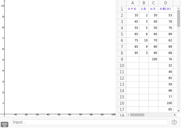
Loading the GeoGebra board and drawing, please wait…
<?xml version="1.0" encoding="utf-8"?>
<geogebra format="4.4" version="4.4.43.0" id="d3f5772c-90b1-4924-8f0d-3c90a7e5c257" xsi:noNamespaceSchemaLocation="http://www.geogebra.org/ggb.xsd" xmlns="" xmlns:xsi="http://www.w3.org/2001/XMLSchema-instance" >
<gui>
<window width="720" height="644" />
<perspectives>
<perspective id="tmp">
<panes>
<pane location="" divider="Infinity" orientation="1" />
</panes>
<views>
<view id="4097" visible="false" inframe="true" stylebar="true" location="1,1,1" size="400" window="519,341,700,550" />
<view id="2" visible="false" inframe="false" stylebar="false" location="3,3" size="200" window="0,0,200,400" />
<view id="8" toolbar="1001 | 1002 | 1003 || 1005 | 1004 || 1006 | 1007 | 1010 | 1011 || 1008 1009 || 6" visible="false" inframe="false" stylebar="true" location="1,3" size="300" window="100,100,600,400" />
<view id="1" visible="true" inframe="false" stylebar="false" location="3" size="455" window="0,0,400,400" />
<view id="4" toolbar="0 59 || 2020 , 2021 , 2022 , 66 || 2001 , 2003 , 2002 , 2004 , 2005 || 2040 , 2041 , 2042 , 2044 , 2043" visible="true" inframe="false" stylebar="true" location="1" size="257" window="0,0,400,400" />
<view id="16" visible="false" inframe="false" stylebar="false" location="1" size="150" window="50,50,500,500" />
<view id="32" visible="false" inframe="false" stylebar="true" location="1" size="150" window="50,50,500,500" />
<view id="64" visible="false" inframe="true" stylebar="true" location="1" size="150" window="50,50,500,500" />
</views>
<toolbar show="false" items="0 39 59 | 1 501 67 , 5 19 , 72 | 2 15 45 , 18 65 , 7 37 | 4 3 8 9 , 13 44 , 58 , 47 | 16 51 64 , 70 | 10 34 53 11 , 24 20 22 , 21 23 | 55 56 57 , 12 | 36 46 , 38 49 50 , 71 | 30 29 54 32 31 33 | 17 26 62 73 , 14 66 68 | 25 52 60 61 | 40 41 42 , 27 28 35 , 6" position="0" help="false" />
<input show="false" cmd="true" top="false" />
<dockBar show="false" east="false" />
</perspective>
</perspectives>
<labelingStyle val="3"/>
<font size="12"/>
<graphicsSettings javaLatexFonts="false"/>
</gui>
<euclidianView>
<size width="455" height="492"/>
<coordSystem xZero="17.749045814556155" yZero="454.3507143184782" scale="4.309333426751615" yscale="43.093334267516155"/>
<evSettings axes="true" grid="false" gridIsBold="false" pointCapturing="3" rightAngleStyle="1" checkboxSize="13" gridType="0"/>
<bgColor r="255" g="255" b="255"/>
<axesColor r="0" g="0" b="0"/>
<gridColor r="192" g="192" b="192"/>
<lineStyle axes="1" grid="10"/>
<axis id="0" show="true" label="" unitLabel="" tickStyle="1" showNumbers="true" tickDistance="10"/>
<axis id="1" show="true" label="" unitLabel="" tickStyle="1" showNumbers="true" tickDistance="1"/>
</euclidianView>
<spreadsheetView>
<size width="257" height="467"/>
<prefCellSize width="70" height="25"/>
<spreadsheetColumn id="0" width="51"/>
<spreadsheetColumn id="1" width="38"/>
<spreadsheetColumn id="2" width="38"/>
<spreadsheetColumn id="3" width="59"/>
<spreadsheetColumn id="4" width="71"/>
<spreadsheetColumn id="5" width="71"/>
<spreadsheetColumn id="6" width="71"/>
<spreadsheetColumn id="7" width="71"/>
<spreadsheetColumn id="8" width="71"/>
<spreadsheetColumn id="9" width="71"/>
<spreadsheetColumn id="10" width="71"/>
<spreadsheetColumn id="11" width="71"/>
<spreadsheetColumn id="12" width="71"/>
<spreadsheetColumn id="13" width="71"/>
<spreadsheetColumn id="14" width="71"/>
<spreadsheetColumn id="15" width="71"/>
<spreadsheetColumn id="16" width="71"/>
<spreadsheetColumn id="17" width="71"/>
<spreadsheetColumn id="18" width="71"/>
<spreadsheetColumn id="19" width="71"/>
<spreadsheetColumn id="20" width="71"/>
<spreadsheetColumn id="21" width="71"/>
<spreadsheetColumn id="22" width="71"/>
<spreadsheetColumn id="23" width="71"/>
<spreadsheetColumn id="24" width="71"/>
<spreadsheetColumn id="25" width="71"/>
<selection hScroll="0" vScroll="0" column="-1" row="-1"/>
<layout showFormulaBar="false" showGrid="true" showHScrollBar="true" showVScrollBar="true" showBrowserPanel="false" showColumnHeader="true" showRowHeader ="true" allowSpecialEditor="false" allowToolTips="true" equalsRequired="false"/>
</spreadsheetView>
<kernel>
<continuous val="false"/>
<usePathAndRegionParameters val="true"/>
<decimals val="2"/>
<angleUnit val="degree"/>
<algebraStyle val="0"/>
<coordStyle val="0"/>
<angleFromInvTrig val="false"/>
</kernel>
<scripting blocked="false" disabled="false"/>
<construction title="" author="" date="27 8 月 2014">
<element type="numeric" label="A2">
<value val="35"/>
<show object="false" label="true"/>
<objColor r="0" g="0" b="0" alpha="0.1"/>
<layer val="0"/>
<labelMode val="1"/>
<fixed val="true"/>
<auxiliary val="true"/>
</element>
<element type="numeric" label="B2">
<value val="2"/>
<show object="false" label="true"/>
<objColor r="0" g="0" b="0" alpha="0.1"/>
<layer val="0"/>
<labelMode val="1"/>
<fixed val="true"/>
<auxiliary val="true"/>
</element>
<element type="numeric" label="C2">
<value val="30"/>
<show object="false" label="true"/>
<objColor r="0" g="0" b="0" alpha="0.1"/>
<layer val="0"/>
<labelMode val="1"/>
<fixed val="true"/>
<auxiliary val="true"/>
</element>
<element type="numeric" label="A3">
<value val="45"/>
<show object="false" label="true"/>
<objColor r="0" g="0" b="0" alpha="0.1"/>
<layer val="0"/>
<labelMode val="1"/>
<fixed val="true"/>
<auxiliary val="true"/>
</element>
<element type="numeric" label="B3">
<value val="3"/>
<show object="false" label="true"/>
<objColor r="0" g="0" b="0" alpha="0.1"/>
<layer val="0"/>
<labelMode val="1"/>
<fixed val="true"/>
<auxiliary val="true"/>
</element>
<element type="numeric" label="C3">
<value val="40"/>
<show object="false" label="true"/>
<objColor r="0" g="0" b="0" alpha="0.1"/>
<layer val="0"/>
<labelMode val="1"/>
<fixed val="true"/>
<auxiliary val="true"/>
</element>
<element type="numeric" label="A4">
<value val="55"/>
<show object="false" label="true"/>
<objColor r="0" g="0" b="0" alpha="0.1"/>
<layer val="0"/>
<labelMode val="1"/>
<fixed val="true"/>
<auxiliary val="true"/>
</element>
<element type="numeric" label="B4">
<value val="5"/>
<show object="false" label="true"/>
<objColor r="0" g="0" b="0" alpha="0.1"/>
<layer val="0"/>
<labelMode val="1"/>
<fixed val="true"/>
<auxiliary val="true"/>
</element>
<element type="numeric" label="C4">
<value val="50"/>
<show object="false" label="true"/>
<objColor r="0" g="0" b="0" alpha="0.1"/>
<layer val="0"/>
<labelMode val="1"/>
<fixed val="true"/>
<auxiliary val="true"/>
</element>
<element type="numeric" label="A5">
<value val="65"/>
<show object="false" label="true"/>
<objColor r="0" g="0" b="0" alpha="0.1"/>
<layer val="0"/>
<labelMode val="1"/>
<fixed val="true"/>
<auxiliary val="true"/>
</element>
<element type="numeric" label="B5">
<value val="8"/>
<show object="false" label="true"/>
<objColor r="0" g="0" b="0" alpha="0.1"/>
<layer val="0"/>
<labelMode val="1"/>
<fixed val="true"/>
<auxiliary val="true"/>
</element>
<element type="numeric" label="C5">
<value val="60"/>
<show object="false" label="true"/>
<objColor r="0" g="0" b="0" alpha="0.1"/>
<layer val="0"/>
<labelMode val="1"/>
<fixed val="true"/>
<auxiliary val="true"/>
</element>
<element type="numeric" label="A6">
<value val="75"/>
<show object="false" label="true"/>
<objColor r="0" g="0" b="0" alpha="0.1"/>
<layer val="0"/>
<labelMode val="1"/>
<fixed val="true"/>
<auxiliary val="true"/>
</element>
<element type="numeric" label="B6">
<value val="10"/>
<show object="false" label="true"/>
<objColor r="0" g="0" b="0" alpha="0.1"/>
<layer val="0"/>
<labelMode val="1"/>
<fixed val="true"/>
<auxiliary val="true"/>
</element>
<element type="numeric" label="C6">
<value val="70"/>
<show object="false" label="true"/>
<objColor r="0" g="0" b="0" alpha="0.1"/>
<layer val="0"/>
<labelMode val="1"/>
<fixed val="true"/>
<auxiliary val="true"/>
</element>
<element type="numeric" label="A7">
<value val="85"/>
<show object="false" label="true"/>
<objColor r="0" g="0" b="0" alpha="0.1"/>
<layer val="0"/>
<labelMode val="1"/>
<fixed val="true"/>
<auxiliary val="true"/>
</element>
<element type="numeric" label="B7">
<value val="9"/>
<show object="false" label="true"/>
<objColor r="0" g="0" b="0" alpha="0.1"/>
<layer val="0"/>
<labelMode val="1"/>
<fixed val="true"/>
<auxiliary val="true"/>
</element>
<element type="numeric" label="C7">
<value val="80"/>
<show object="false" label="true"/>
<objColor r="0" g="0" b="0" alpha="0.1"/>
<layer val="0"/>
<labelMode val="1"/>
<fixed val="true"/>
<auxiliary val="true"/>
</element>
<element type="numeric" label="A8">
<value val="95"/>
<show object="false" label="true"/>
<objColor r="0" g="0" b="0" alpha="0.1"/>
<layer val="0"/>
<labelMode val="1"/>
<fixed val="true"/>
<auxiliary val="true"/>
</element>
<element type="numeric" label="B8">
<value val="3"/>
<show object="false" label="true"/>
<objColor r="0" g="0" b="0" alpha="0.1"/>
<layer val="0"/>
<labelMode val="1"/>
<fixed val="true"/>
<auxiliary val="true"/>
</element>
<element type="numeric" label="C8">
<value val="90"/>
<show object="false" label="true"/>
<objColor r="0" g="0" b="0" alpha="0.1"/>
<layer val="0"/>
<labelMode val="1"/>
<fixed val="true"/>
<auxiliary val="true"/>
</element>
<element type="numeric" label="C9">
<value val="100"/>
<show object="false" label="true"/>
<objColor r="0" g="0" b="0" alpha="0.1"/>
<layer val="0"/>
<labelMode val="1"/>
<fixed val="true"/>
<auxiliary val="true"/>
</element>
<expression label="C1" exp=""組界""/>
<element type="text" label="C1">
<show object="false" label="false"/>
<objColor r="102" g="0" b="255" alpha="0"/>
<layer val="0"/>
<labelMode val="0"/>
<fixed val="true"/>
</element>
<expression label="A1" exp=""組中點""/>
<element type="text" label="A1">
<show object="false" label="false"/>
<objColor r="102" g="0" b="255" alpha="0"/>
<layer val="0"/>
<labelMode val="0"/>
<fixed val="true"/>
</element>
<expression label="B1" exp=""次數""/>
<element type="text" label="B1">
<show object="false" label="false"/>
<objColor r="102" g="0" b="255" alpha="0"/>
<layer val="0"/>
<labelMode val="0"/>
<fixed val="true"/>
</element>
<expression label="D1" exp=""分數(分)""/>
<element type="text" label="D1">
<show object="false" label="false"/>
<objColor r="0" g="0" b="255" alpha="0"/>
<layer val="0"/>
<labelMode val="0"/>
</element>
<element type="numeric" label="D2">
<value val="53"/>
<show object="false" label="false"/>
<objColor r="0" g="0" b="0" alpha="0.1"/>
<layer val="0"/>
<labelMode val="1"/>
<animation step="0.1" speed="1" type="0" playing="false"/>
<auxiliary val="true"/>
</element>
<element type="numeric" label="D3">
<value val="78"/>
<show object="false" label="false"/>
<objColor r="0" g="0" b="0" alpha="0.1"/>
<layer val="0"/>
<labelMode val="1"/>
<animation step="0.1" speed="1" type="0" playing="false"/>
<auxiliary val="true"/>
</element>
<element type="numeric" label="D4">
<value val="76"/>
<show object="false" label="false"/>
<objColor r="0" g="0" b="0" alpha="0.1"/>
<layer val="0"/>
<labelMode val="1"/>
<animation step="0.1" speed="1" type="0" playing="false"/>
<auxiliary val="true"/>
</element>
<element type="numeric" label="D5">
<value val="89"/>
<show object="false" label="false"/>
<objColor r="0" g="0" b="0" alpha="0.1"/>
<layer val="0"/>
<labelMode val="1"/>
<animation step="0.1" speed="1" type="0" playing="false"/>
<auxiliary val="true"/>
</element>
<element type="numeric" label="D6">
<value val="62"/>
<show object="false" label="false"/>
<objColor r="0" g="0" b="0" alpha="0.1"/>
<layer val="0"/>
<labelMode val="1"/>
<animation step="0.1" speed="1" type="0" playing="false"/>
<auxiliary val="true"/>
</element>
<element type="numeric" label="D7">
<value val="89"/>
<show object="false" label="false"/>
<objColor r="0" g="0" b="0" alpha="0.1"/>
<layer val="0"/>
<labelMode val="1"/>
<animation step="0.1" speed="1" type="0" playing="false"/>
<auxiliary val="true"/>
</element>
<element type="numeric" label="D8">
<value val="68"/>
<show object="false" label="false"/>
<objColor r="0" g="0" b="0" alpha="0.1"/>
<layer val="0"/>
<labelMode val="1"/>
<animation step="0.1" speed="1" type="0" playing="false"/>
<auxiliary val="true"/>
</element>
<element type="numeric" label="D9">
<value val="76"/>
<show object="false" label="false"/>
<objColor r="0" g="0" b="0" alpha="0.1"/>
<layer val="0"/>
<labelMode val="1"/>
<animation step="0.1" speed="1" type="0" playing="false"/>
<auxiliary val="true"/>
</element>
<element type="numeric" label="D10">
<value val="32"/>
<show object="false" label="false"/>
<objColor r="0" g="0" b="0" alpha="0.1"/>
<layer val="0"/>
<labelMode val="1"/>
<animation step="0.1" speed="1" type="0" playing="false"/>
<auxiliary val="true"/>
</element>
<element type="numeric" label="D11">
<value val="46"/>
<show object="false" label="false"/>
<objColor r="0" g="0" b="0" alpha="0.1"/>
<layer val="0"/>
<labelMode val="1"/>
<animation step="0.1" speed="1" type="0" playing="false"/>
<auxiliary val="true"/>
</element>
<element type="numeric" label="D12">
<value val="85"/>
<show object="false" label="false"/>
<objColor r="0" g="0" b="0" alpha="0.1"/>
<layer val="0"/>
<labelMode val="1"/>
<animation step="0.1" speed="1" type="0" playing="false"/>
<auxiliary val="true"/>
</element>
<element type="numeric" label="D13">
<value val="59"/>
<show object="false" label="false"/>
<objColor r="0" g="0" b="0" alpha="0.1"/>
<layer val="0"/>
<labelMode val="1"/>
<animation step="0.1" speed="1" type="0" playing="false"/>
<auxiliary val="true"/>
</element>
<element type="numeric" label="D14">
<value val="86"/>
<show object="false" label="false"/>
<objColor r="0" g="0" b="0" alpha="0.1"/>
<layer val="0"/>
<labelMode val="1"/>
<animation step="0.1" speed="1" type="0" playing="false"/>
<auxiliary val="true"/>
</element>
<element type="numeric" label="D15">
<value val="77"/>
<show object="false" label="false"/>
<objColor r="0" g="0" b="0" alpha="0.1"/>
<layer val="0"/>
<labelMode val="1"/>
<animation step="0.1" speed="1" type="0" playing="false"/>
<auxiliary val="true"/>
</element>
<element type="numeric" label="D16">
<value val="100"/>
<show object="false" label="false"/>
<objColor r="0" g="0" b="0" alpha="0.1"/>
<layer val="0"/>
<labelMode val="1"/>
<animation step="0.1" speed="1" type="0" playing="false"/>
<auxiliary val="true"/>
</element>
<element type="numeric" label="D17">
<value val="65"/>
<show object="false" label="false"/>
<objColor r="0" g="0" b="0" alpha="0.1"/>
<layer val="0"/>
<labelMode val="1"/>
<animation step="0.1" speed="1" type="0" playing="false"/>
<auxiliary val="true"/>
</element>
<element type="numeric" label="D18">
<value val="69"/>
<show object="false" label="false"/>
<objColor r="0" g="0" b="0" alpha="0.1"/>
<layer val="0"/>
<labelMode val="1"/>
<animation step="0.1" speed="1" type="0" playing="false"/>
<auxiliary val="true"/>
</element>
<element type="numeric" label="D19">
<value val="92"/>
<show object="false" label="false"/>
<objColor r="0" g="0" b="0" alpha="0.1"/>
<layer val="0"/>
<labelMode val="1"/>
<animation step="0.1" speed="1" type="0" playing="false"/>
<auxiliary val="true"/>
</element>
<element type="numeric" label="D20">
<value val="84"/>
<show object="false" label="false"/>
<objColor r="0" g="0" b="0" alpha="0.1"/>
<layer val="0"/>
<labelMode val="1"/>
<animation step="0.1" speed="1" type="0" playing="false"/>
<auxiliary val="true"/>
</element>
<element type="numeric" label="D21">
<value val="75"/>
<show object="false" label="false"/>
<objColor r="0" g="0" b="0" alpha="0.1"/>
<layer val="0"/>
<labelMode val="1"/>
<animation step="0.1" speed="1" type="0" playing="false"/>
<auxiliary val="true"/>
</element>
<element type="numeric" label="D22">
<value val="72"/>
<show object="false" label="false"/>
<objColor r="0" g="0" b="0" alpha="0.1"/>
<layer val="0"/>
<labelMode val="1"/>
<animation step="0.1" speed="1" type="0" playing="false"/>
<auxiliary val="true"/>
</element>
<element type="numeric" label="D23">
<value val="85"/>
<show object="false" label="false"/>
<objColor r="0" g="0" b="0" alpha="0.1"/>
<layer val="0"/>
<labelMode val="1"/>
<animation step="0.1" speed="1" type="0" playing="false"/>
<auxiliary val="true"/>
</element>
<element type="numeric" label="D24">
<value val="60"/>
<show object="false" label="false"/>
<objColor r="0" g="0" b="0" alpha="0.1"/>
<layer val="0"/>
<labelMode val="1"/>
<animation step="0.1" speed="1" type="0" playing="false"/>
<auxiliary val="true"/>
</element>
<element type="numeric" label="D25">
<value val="98"/>
<show object="false" label="false"/>
<objColor r="0" g="0" b="0" alpha="0.1"/>
<layer val="0"/>
<labelMode val="1"/>
<animation step="0.1" speed="1" type="0" playing="false"/>
<auxiliary val="true"/>
</element>
<element type="numeric" label="D26">
<value val="55"/>
<show object="false" label="false"/>
<objColor r="0" g="0" b="0" alpha="0.1"/>
<layer val="0"/>
<labelMode val="1"/>
<animation step="0.1" speed="1" type="0" playing="false"/>
<auxiliary val="true"/>
</element>
<element type="numeric" label="D27">
<value val="79"/>
<show object="false" label="false"/>
<objColor r="0" g="0" b="0" alpha="0.1"/>
<layer val="0"/>
<labelMode val="1"/>
<animation step="0.1" speed="1" type="0" playing="false"/>
<auxiliary val="true"/>
</element>
<element type="numeric" label="D28">
<value val="82"/>
<show object="false" label="false"/>
<objColor r="0" g="0" b="0" alpha="0.1"/>
<layer val="0"/>
<labelMode val="1"/>
<animation step="0.1" speed="1" type="0" playing="false"/>
<auxiliary val="true"/>
</element>
<element type="numeric" label="D29">
<value val="52"/>
<show object="false" label="false"/>
<objColor r="0" g="0" b="0" alpha="0.1"/>
<layer val="0"/>
<labelMode val="1"/>
<animation step="0.1" speed="1" type="0" playing="false"/>
<auxiliary val="true"/>
</element>
<element type="numeric" label="D30">
<value val="38"/>
<show object="false" label="false"/>
<objColor r="0" g="0" b="0" alpha="0.1"/>
<layer val="0"/>
<labelMode val="1"/>
<animation step="0.1" speed="1" type="0" playing="false"/>
<auxiliary val="true"/>
</element>
<element type="numeric" label="D31">
<value val="64"/>
<show object="false" label="false"/>
<objColor r="0" g="0" b="0" alpha="0.1"/>
<layer val="0"/>
<labelMode val="1"/>
<animation step="0.1" speed="1" type="0" playing="false"/>
<auxiliary val="true"/>
</element>
<element type="numeric" label="D32">
<value val="73"/>
<show object="false" label="false"/>
<objColor r="0" g="0" b="0" alpha="0.1"/>
<layer val="0"/>
<labelMode val="1"/>
<animation step="0.1" speed="1" type="0" playing="false"/>
<auxiliary val="true"/>
</element>
<element type="numeric" label="D33">
<value val="66"/>
<show object="false" label="false"/>
<objColor r="0" g="0" b="0" alpha="0.1"/>
<layer val="0"/>
<labelMode val="1"/>
<animation step="0.1" speed="1" type="0" playing="false"/>
<auxiliary val="true"/>
</element>
<element type="numeric" label="D34">
<value val="81"/>
<show object="false" label="false"/>
<objColor r="0" g="0" b="0" alpha="0.1"/>
<layer val="0"/>
<labelMode val="1"/>
<animation step="0.1" speed="1" type="0" playing="false"/>
<auxiliary val="true"/>
</element>
<element type="numeric" label="D35">
<value val="48"/>
<show object="false" label="false"/>
<objColor r="0" g="0" b="0" alpha="0.1"/>
<layer val="0"/>
<labelMode val="1"/>
<animation step="0.1" speed="1" type="0" playing="false"/>
<auxiliary val="true"/>
</element>
<element type="numeric" label="D36">
<value val="60"/>
<show object="false" label="false"/>
<objColor r="0" g="0" b="0" alpha="0.1"/>
<layer val="0"/>
<labelMode val="1"/>
<animation step="0.1" speed="1" type="0" playing="false"/>
<auxiliary val="true"/>
</element>
<element type="numeric" label="D37">
<value val="88"/>
<show object="false" label="false"/>
<objColor r="0" g="0" b="0" alpha="0.1"/>
<layer val="0"/>
<labelMode val="1"/>
<animation step="0.1" speed="1" type="0" playing="false"/>
<auxiliary val="true"/>
</element>
<element type="numeric" label="D38">
<value val="57"/>
<show object="false" label="false"/>
<objColor r="0" g="0" b="0" alpha="0.1"/>
<layer val="0"/>
<labelMode val="1"/>
<animation step="0.1" speed="1" type="0" playing="false"/>
<auxiliary val="true"/>
</element>
<element type="numeric" label="D39">
<value val="75"/>
<show object="false" label="false"/>
<objColor r="0" g="0" b="0" alpha="0.1"/>
<layer val="0"/>
<labelMode val="1"/>
<animation step="0.1" speed="1" type="0" playing="false"/>
<auxiliary val="true"/>
</element>
<element type="numeric" label="D40">
<value val="70"/>
<show object="false" label="false"/>
<objColor r="0" g="0" b="0" alpha="0.1"/>
<layer val="0"/>
<labelMode val="1"/>
<animation step="0.1" speed="1" type="0" playing="false"/>
<auxiliary val="true"/>
</element>
<element type="numeric" label="D41">
<value val="49"/>
<show object="false" label="false"/>
<objColor r="0" g="0" b="0" alpha="0.1"/>
<layer val="0"/>
<labelMode val="1"/>
<animation step="0.1" speed="1" type="0" playing="false"/>
<auxiliary val="true"/>
</element>
</construction>
</geogebra>